Tradebeyond • 2024
Design System
Google Material 3
Atomic Design
Design Tokens
Advance Figma

Background
When I joined Tradebeyond, I notice the legacy "design system" is poorly maintain and is basically unusable. This situation not only slow down design process since there is no system to follow, it also create a inconsistent experience between different product. As a result, I took the initiative to establish a design system for Tradebeyond.
Chanllenges
The challenges we face can sum up in below:
(a). Missing a centralise components library. Past designer creates their own components in separated files casues a vicious cycle that makes the component library more and more fragmented.
(b). No foundation to follow. Take color as an example, If I want a color that convey success, I simply can't find one because no such foundation color token is defined. Result in all sorts of different colors used in different Tradebeyond's products
(c). Lack of documentation and design guidelines.
To solve these problems, I took ideas from the famous atomic design to start with.
The Atomic Design
Below sections will go through how I uses the concept of atomic design and applied to Tradebeyond's products, with the inspection app - Inspection Pro being the primary example. Click here to learn more about "Inspection Pro" first.

Atoms
To start off, design tokens needs to be defined. This ensure every UI element uses the same set of token instead of each designer coming up with their own values. These "atoms" can range from color to radius corner, and icon to font size.
Using Figma's "variables" feature for creating and managing design tokens. I set up foundation token so designer can match them to semantic token for the UI element to use. These semantic token uses name that describe their purpose in short and clear form. Below are some color token for Web Platform.

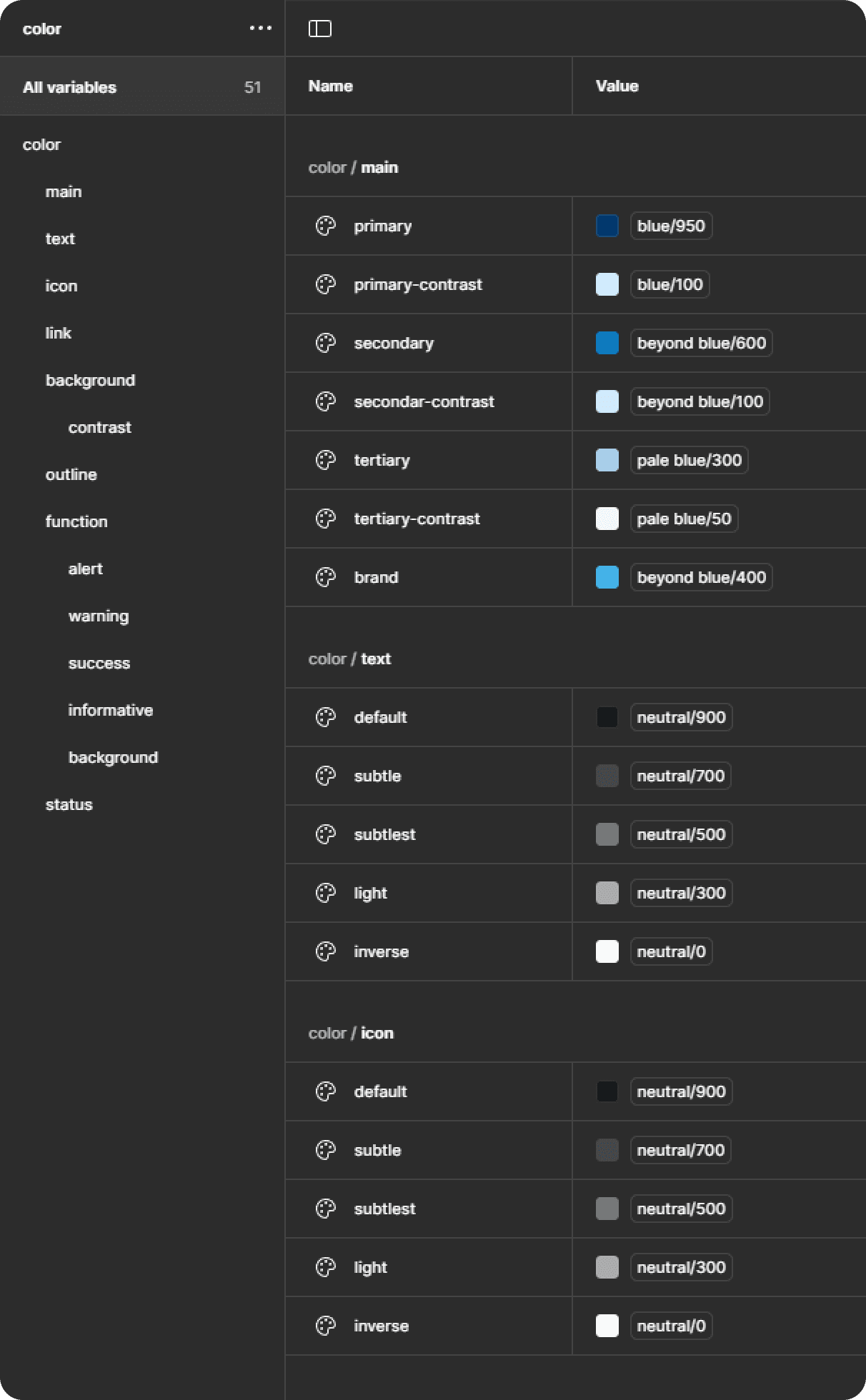
Web Color Token
As for the Mobile App (e.g. Inspection Pro), since we are using Google's Material 3 Design System under Flutter framework. I can use the same set of foundation token but match them to Material 3 semantic token. Creating a consistent color between Web platform and Mobile product .
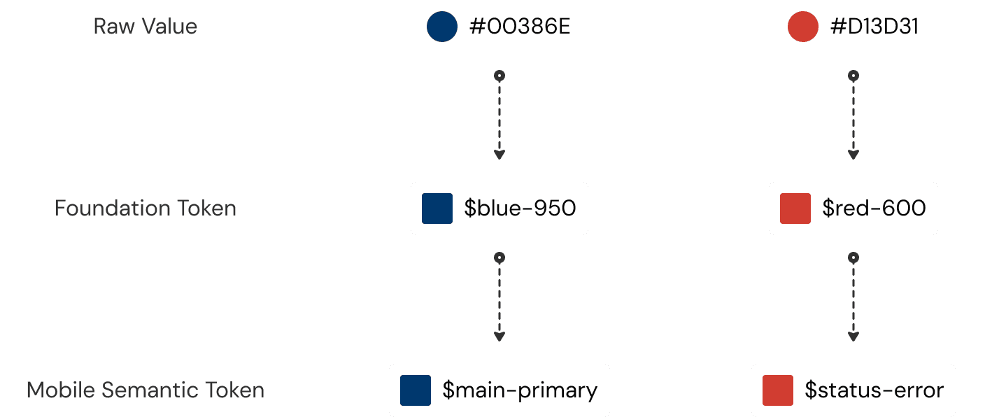
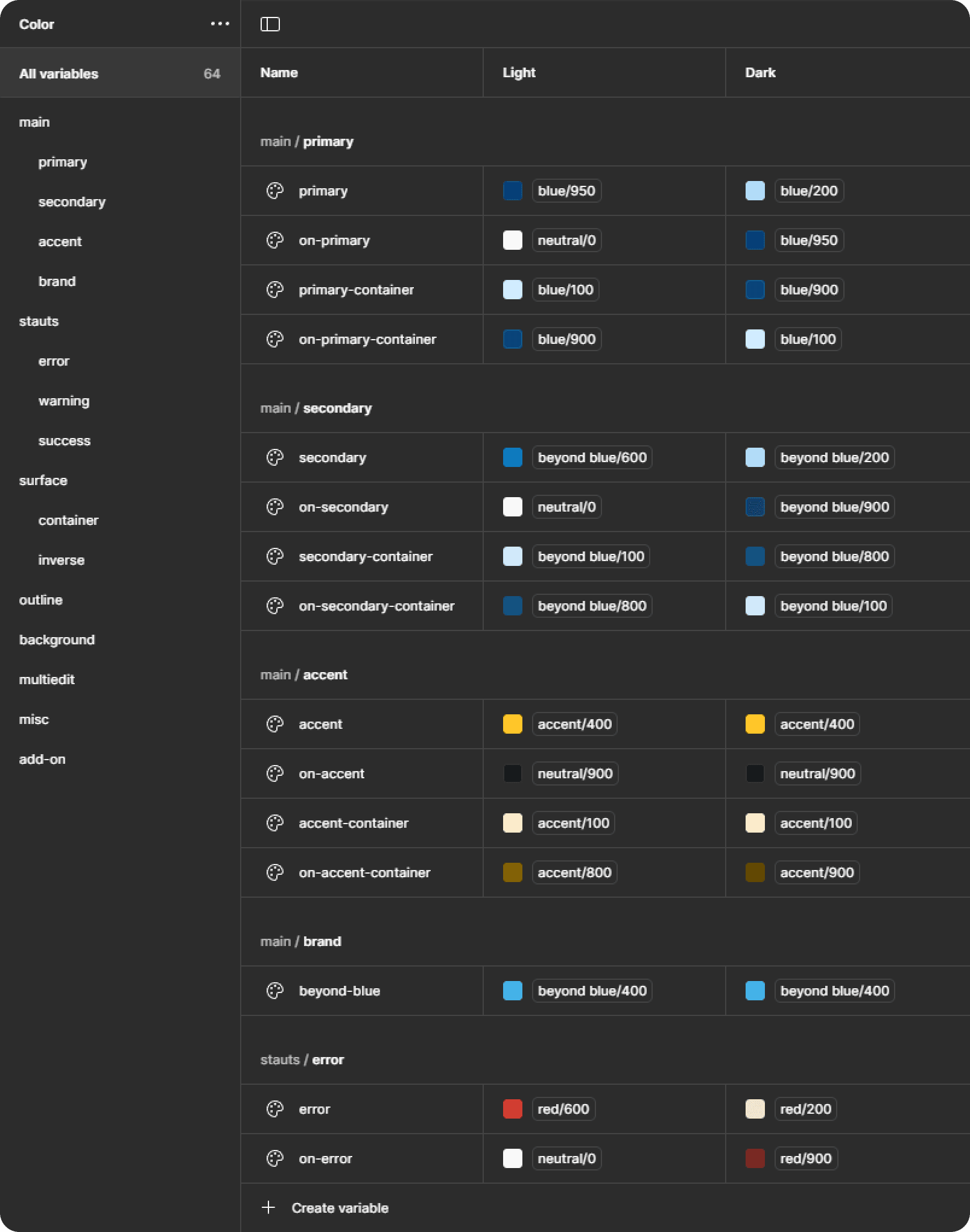
Mobile (Material 3) Color Token
Molecules
Once we have the "atoms" ready, we can create the components. In Inspection Pro, although there are already handful of components ready to use in Material 3 library, some custom components are still needed.

Some examples of Inspection Pro's components
Organism
Next, multiple "molecules" combine to form "organism". In another word, larger component that are made with several smaller components.

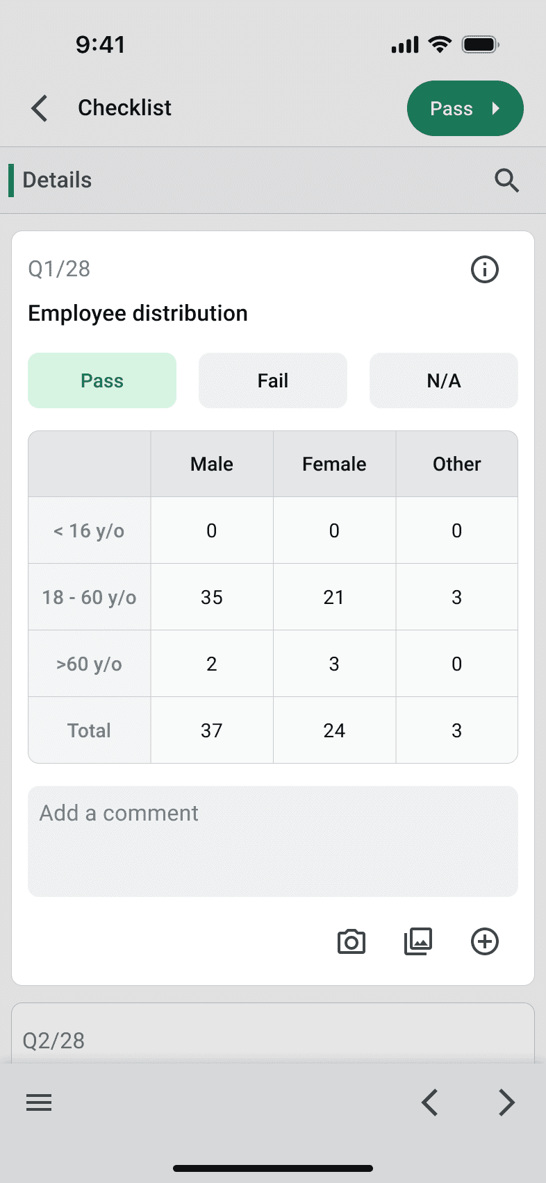
This checklist card include components of
• Inline Table
• Text Field
• Icon Button.
Use case : During inspection, the inspector might need to answer a series of question. They do so by completing these checklist card
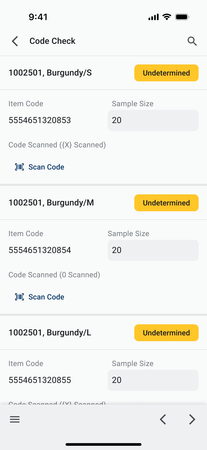
This section of UI include components of
• Result Chip
• Text Field
• Text Button.
Use case : A code check section is where the inspector need to scan the code on the product to see if it matches with the item code.
Templates
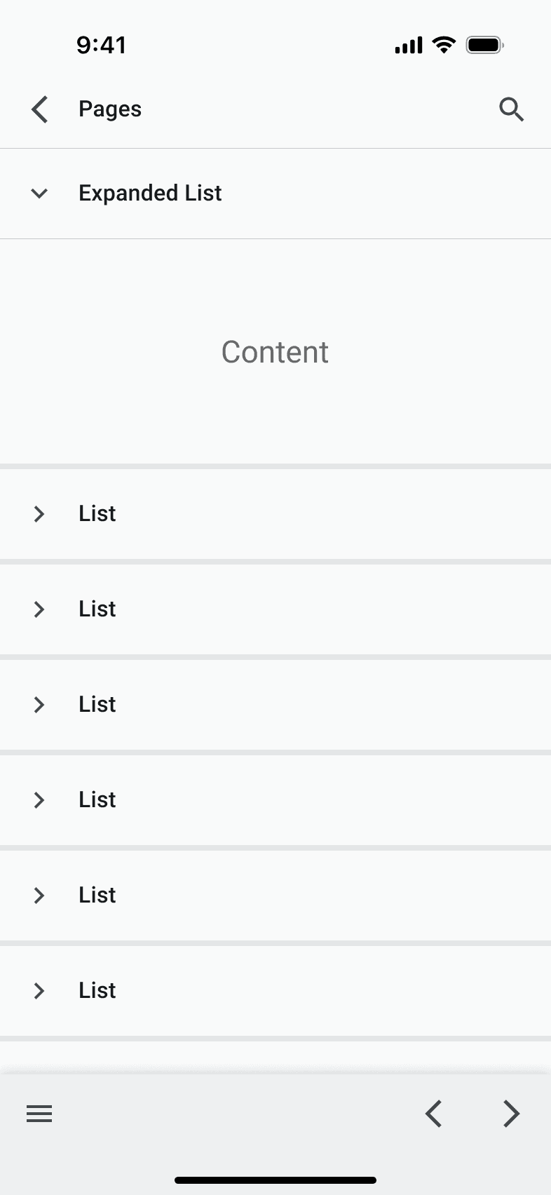
With various UI component in place, it is crucial to setup some template or pattern for these component to fit in. This can ensure a consistent UI/UX across the app. Here are the 4 main templates of Inspection Pro.
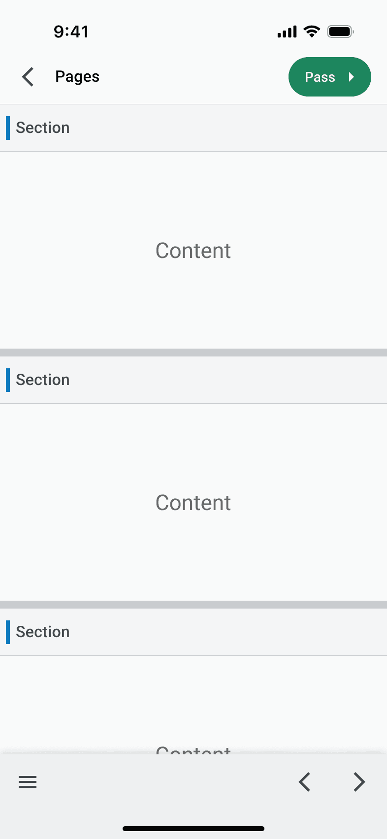
Sectionize Page

Sectionize Page w/ List
List Only Page
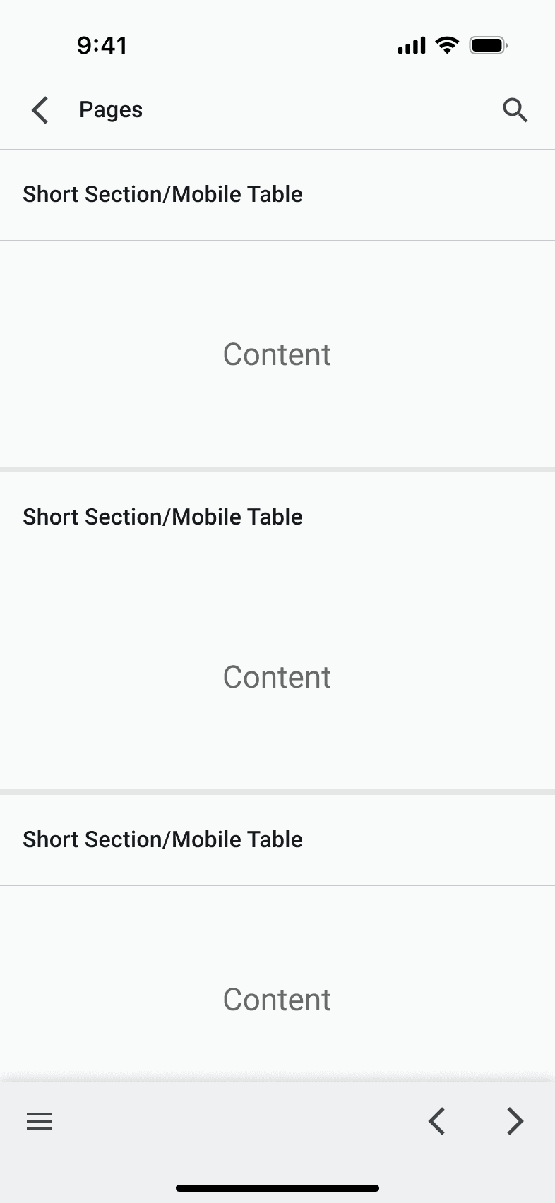
Short Section/Mobile Table
Configuration
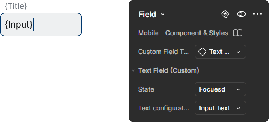
Components contain different properties by using feature from Figma like "Swap Instance", "Nested Instance", "Variant" & "Boolean Properties" etc. For examples, designer can toggle different element that appears in the checklist card, or change the field to different type or state.

Accessibility
All UI component color contrast passes the WCAG AA standard to meet the accessibility requirement. Both normal and large text have a color contrast larger than 4.5 : 1 .

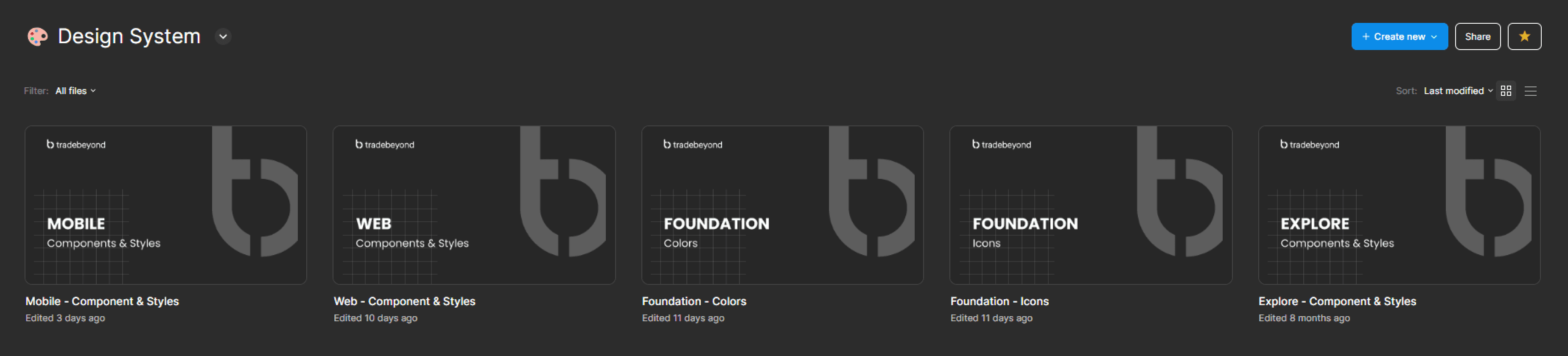
Final Result
After months of work, I have set up a initial design system for Tradebeyond. With 2 foundation file of color and icon, where the centralise color token/palette and icon is stored. Then, products from mobile and web have their components built on the foundation. All of the components built will also be placed inside a single file for clear documentation and organisation.