Tradebeyond • 2024-25
UIUX Design
System Thinking
"0" to 1
Prototyping
B2B
Background
Tradebeyond is a SaaS company which provide solution for retailer to manage their supply chain operation. Client uses our platform to manage their product, track order shipment and organize QC/QA task etc.
In 2023, Tradebeyond made a strategic move by acquiring Pivot88, with one of the key objectives being the integration of both companies' inspection products. The goal was to create a single inspection app and compete to become the leading product in the market. I was in charge of the UI/UX design on this project from ideation to implementation.
Challenge
Although we are building a "new" inspection app, we are essentially redesigning our two existing inspection app into one (shown below). Like all major revamp project, the biggest challenge will be the backlash of user when they transit to the new product. Therefore, how might we minimize potential re-training cost, while take this opportunity to improve the existing app will be the biggest challenges through out the project.

Tradebeyond Legacy Inspection App

Pivot88 Inspection App
Process
In the early-stage meeting with stakeholders, we had concluded to design the new app base on Pivot88 app due to the much larger user base they have. Doing so can reduce re-training to the majority of current inspection app user. To overcome the challenge mention above, I follow the thought process below when designing the new inspection app.
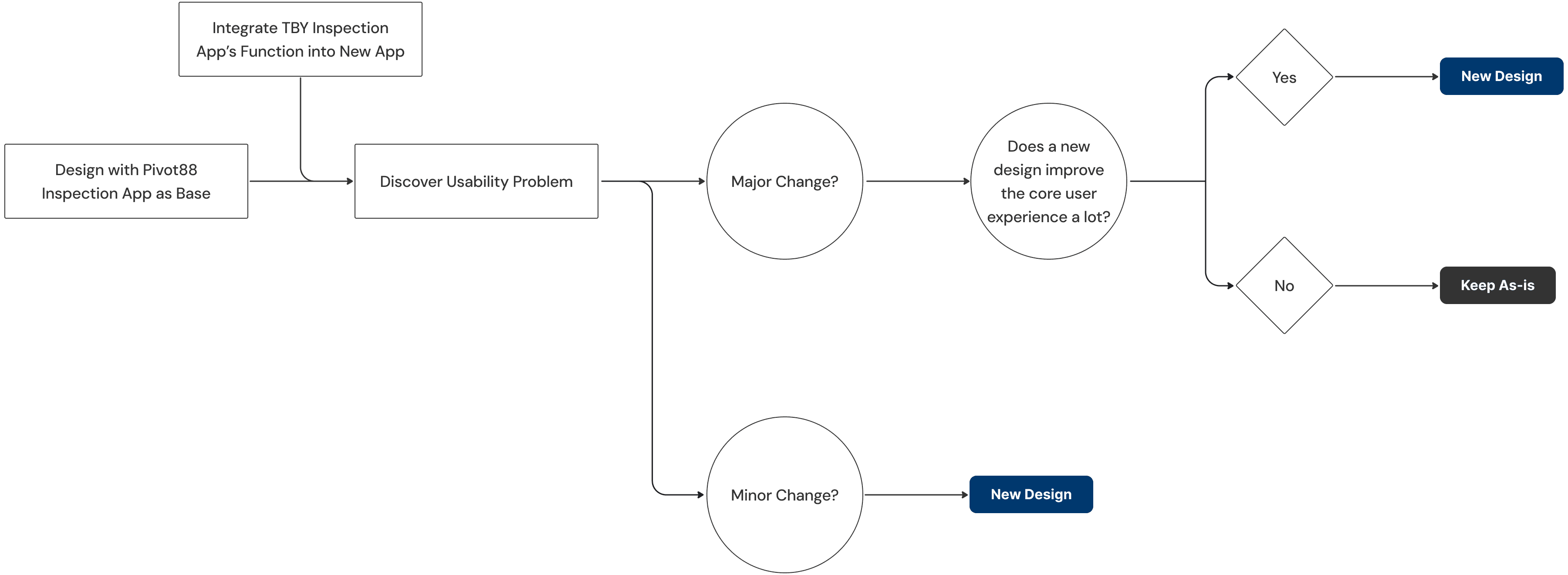
Since I am using Pivot88's design as base, a big part of the new inspection app resemble Pivot88 app. All I need to do was design a new set of UI that both Pivot88 & Tradebeyond existing inspection app can fit into. Click here to view the case study on how I establish the design system for the new inspection app, as well as other Tradebeyond's product.
Having that said, some feature still require a re-design to enhance the usability and a few new designs are introduce to the new app too.
Key Design
[Measurement Keyboard]
During the inspection process, there is a part where the inspector are required to log the measurement of the product at different POM (Point of Measurement). For instance a T-shirt, the inspector might need to check the sleeve length or the shoulder width. To do so, they first click on the cell of the POM they are measuring, an overlay will appear with the target value inputted. Then they can either change the value by clicking the "-" & "+" or click the arrow to move on to next cell. This existing design has some usability issues.
(a). Blocking POM header
The overlay cover the POM name which user complain about.
(b). Constant changing on-screen position
When navigating to next cell, the overlay is constantly moving along with it. Creating excessive hand motion which user may find annoyed.
(c). Troublesome to open keypad
Require an extra click to access the keypad
The new design uses a fixed custom keyboard to address the problems. The user can now adjust the intervals while directly type in the keypad, and not having the touch area move around. During the client feedback session, the new design is proved to be much preferred.
[Result Visualization]
In the summary section, the result is calculated by a industry rule call AQL. During inspection the inspector might found some defect on the product with different severity (e.g. critical or major defect), these defect is then being counted along the inspection. If the defect quantity ≤ accept quantity, the result pass ; but if defect quantity ≥ reject quantity, the result failed. In the old design, the numbers was shown in a table view, which is not very intuitive to interpret. Therefore I designed a meter to visualize the result for easier understanding. Also serve as a nice to have feature to improve the UI aesthetic.
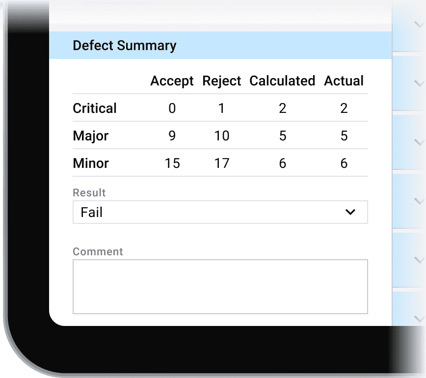
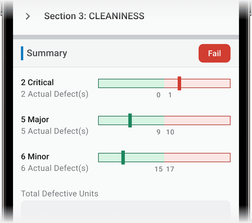
Table ; Take major defect as example, it is acceptable to have 9 major defect, but the result will failed is there is 10 or more.
AQL Meter ; Result indicated by the bar's position and color
[Responsive Layout]
Neither the existing apps have proper responsive design as they are mainly design for tablet. For the new inspection app, a UX friendly mobile view is consider to be a selling point. Therefore, certain parts of the app need to be optimize for smaller screen.
(a). Bottom Navigation Bar
Bottom tab become crowded in mobile view if there is too many pages. This not only truncated the pages name but also make clicking on the pages more difficult due to smaller area.

Pivot88 Inspection App with crowded bottom bar
New mobile design collapse the tabs into a bottom sheet menu with navigation action where user can quickly switch back and forth between pages. Whereas the tablet view stay the same.
Inspection Pro Tablet Nav Bar ; All pages is shown.

Inspection Pro Mobile Nav Bar ; The left icon open the menu, the right icons are use to navigate between pages.
(b). Responsive Table
A table is hard to read in mobile view since user have to constantly perform horizontal scroll to read all the information in it.

Tradebeyond Legacy Inspection App
In the new design, the table switches to a vertical form in mobile view for easier reading. It can also collapse and expand too.
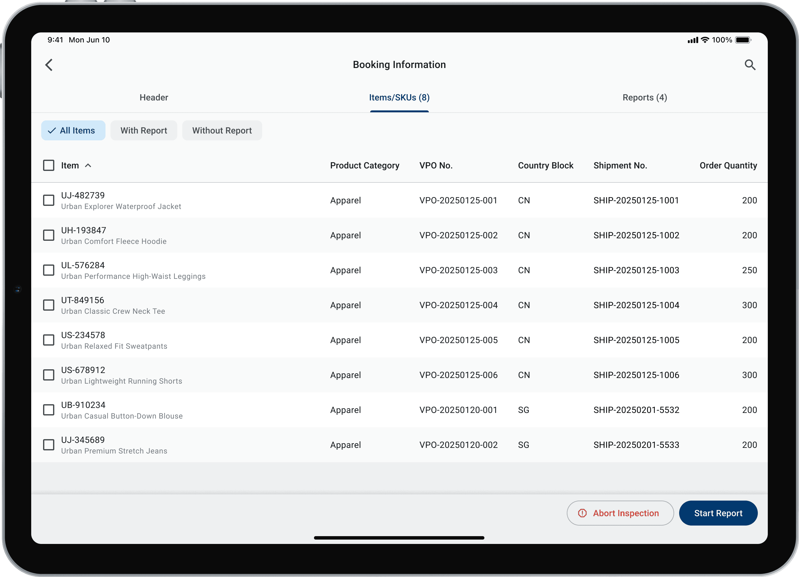
Inspection Pro Tablet Table
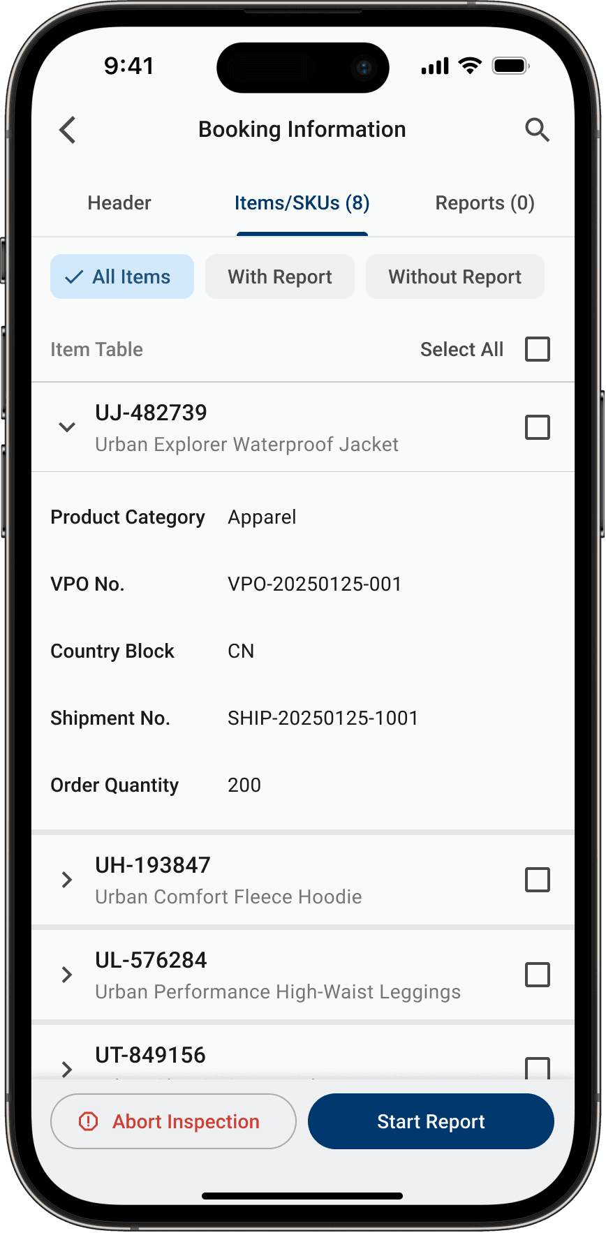
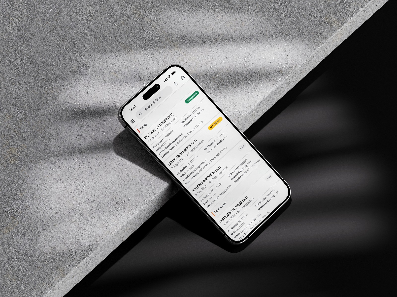
Inspection Pro Mobile Table
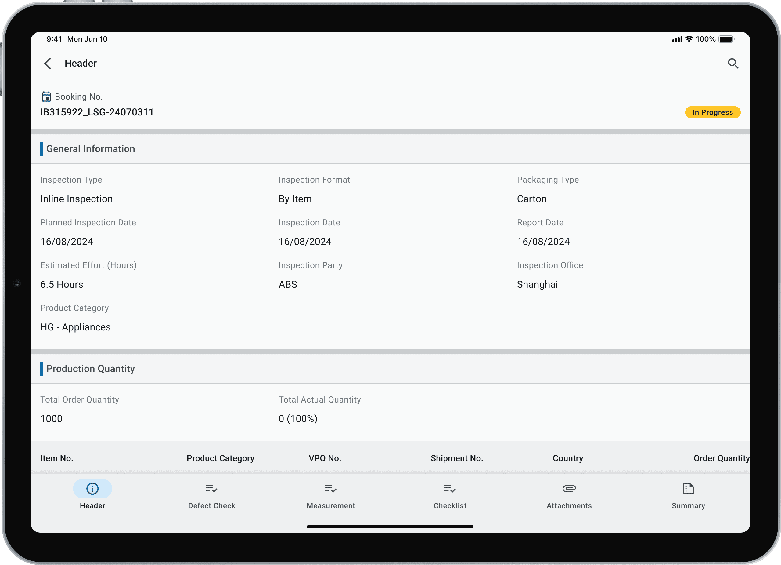
[Result Indicator]
One of the pain point of inspector during inspection is they always have to scroll away to check out the current report result. A global result indicator is introduced to allow inspector to beware of the current report status constantly. They can also click on it to view the detail summary.
Pivot88's App Design ; User need to scroll down to see the current result
New Design ; A result button is in the top bar for quick review
[Mandatory Field Alert Prompt]
As an inspector, having a quick way to navigate to mandatory field is convenient, so there is no need to scroll through dozens of fields and clicking between pages only to find that one mandatory field. To address this, we came up with a mandatory field alert prompt design to facilitate inspector to quickly finish the report with quick navigation to mandatory field.
User can expand the alert prompt and click through the mandatory field ; Alert prompt will auto minimize upon scrolling away